Piezography Manual
Image Preparation
Overview
This chapter was originally written for The New Piezography Workshop Manual given in printed form to each lucky attendee of a Piezography workshop at Cone Editions in Vermont. A few paragraphs may mention the workshop curricula and workflow but it all applies to real-world users so we decided to include it in this manual. We teach Piezography and PiezoDN workshops regularly at Cone Editions. You can get more information at cone-editions.com!
Image Acquisition - Scanning
There is still considerable interest in film. I for one am returning to 4x5 film and platinum/palladium printing. It seems the further we advance the further we look back for inspiration and guidance. However, many Piezographers do not yet shoot digital and rely on scanning their film negatives. And some may have never shot film and this section may not be of any use at all. But, for those who do have film - here is what we would do at Cone Editions Press.
We use a drum scanner because in simple terms, it produces the highest possible standard. However, our practices can easily be translated to any other scanner.
In terms of scanners - they fall into several categories. Drum scanners are essentially analogue devices that use light to read density changes and this analogue information is then converted to digital information. Because of the use of photomultiplier tubes they are significantly more sensitive than their digital counterparts (flatbed CCD). However, scanners like our $110,000 HELL 3400 are now available on eBay for under $1,500. In fact, there usually are no bids for these scanners. Nobody wants them! :(
Small desktop drum scanners were made by Howtek, Screen and are still made by Aztek. These are available but often require older operating systems and SCSI compatible computers. It is essential that the drums be scratch free. It is an option to consider and with just a little practice you can become a drum scanner operator.
What you gain from drum scanning is significantly better detail and information from negatives that are either too thin or too dense to be scanned via CCD. The information drawn out by the photomultiplier tubes will be noise free. Further, because the process is essentially analogue the quality of the scans produced are virtually noise-free and digital-artifact-free. I can usually spot a scan from a Flextight scanner. They leave behind a digital footprint. Drum scanners produce exquisitely smooth scans.
The next classification belongs to Flextight, but only because they have a superior ADC (analogue to digital converter). Yet, at the price entry and considering the cost of used drum scanners, they offer no real advantage other than tiny footprints that allow them to be moved easily and sit within a small space on a desktop. Further, they work with current operating systems. They are fast, efficient, and arguably produce better input than ordinary CCD scanners.
The CCD scanner, of which Nikon used to make delicious ones, is now populated by Epson. The V750 & V850 are a miraculous value being under $1,000. These are fully capable of scanning large and small format film. The results are worth every dollar spent on the hardware - unless you happen to have room for a used 3,000lb HELL drum scanner (which you can pick up for about the same cost). A CCD can not compare to a drum scanner no matter what anyone tells you - especially if you are outputting to Piezography. But, don’t let that stop you from using one. Excellence is all relative and we have to let you know the best practice - which is not the only practice!
Piezography prints with significantly more acuity than does any OEM printer driver. It therefore reveals more digital artifacts and noise . We need space in our studio - our HELL takes up a lot. There is a reason why we keep it and why many of our clients pay up to $250 per scan. Just nothing like a good drum scan. Having said that, we have produced excellent quality Piezography prints from Flextight scans, Epson scans, iPhone captures, and even older Nikon scans. It’s all good provided that they produce your scans in a way that is designed to allow Piezography to produce smooth tone and both shadow and highlight detail, without too much unwanted film grain.
The film being scanned should be dust-free and without scratches. If the film is lightly scratched, it will benefit from oil mounting (when the film is encased in a mounting fluid during scanning). Drum scanners are designed for oil mounting. Oil mounting is an option on the two Epson scanners. It is something to consider. Oil mounting can also help hide some film grain. But, cleaning the film with film cleaner is often easier than dusting and spotting in Photoshop. Special film wipes are sold for this purpose that prevent further scratching.
The basic concept in scanning film for Piezography is to scan “flat”. Scanning flat is when the film is scanned raw without respect to dMin and dMax. This is usually done in 16bit mode and then the dMin and dMax are assigned to specific values later during Photoshop image editing.
What we consider to be a better practice is to assign the dMin and dMax during scanning to the film base+ fog and the fully exposed film. By doing so, the exposed film from just above film base+ fog and just below fully exposed film is scanned in their correct and respective values in relation to the exposure (which may need correction). But basically, everything in the negative is scanned and nothing in the negative is not scanned. There will be full detail available for editing.
The conventional process that everyone else uses is to use “auto” or to pick highlights and shadows - and the scanner then produces a “normal” contrast scan of the negative. The problem with this approach is that if you pick a highlight that is not the brightest and a shadow that is not the darkest, you will clip (eliminate, or assign to pure white or pure black) information that you can not recover. This method of scanning is so common that you may find it very difficult to find the “auto contrast” box to uncheck in your scanner software. But, clearly you should not allow the software to “auto” anything.
The conventional technique that we use is to set our white point tool on clear film and our black point tool on fully exposed film leader (when available). Otherwise, you can scan without any auto adjustments using 16bit and safely (to the image file) make these adjustments using the white point and black point in the Levels or Curves dialogue.
White point and black point tools usually look something like this:

They are used by the scanning software, as well as in Photoshop, to assign L0 (or your custom value black point) to the pixel value which you click it on and to assign L255 (or your custom value white point) to the pixel value which you click it on. Photographing a sheet of cardboard in a dense fog would probably not result in any appropriate black and white points.
Obviously, you would not use this tool on the darkest and brightest pixels in a scan of that type of photograph. But, we say obviously you should not use these tools on any information in your scans unless they are absolutely pure black (without any detail whatsoever) and pure specular (paper white) highlight. So where do you click in that case?
This is the question of Piezography. Where do you want a pure black and a pure specular highlight? Do you want a pure black and a pure specular highlight? Forget about 100 years of conventional silver printing and the rule that you are required to define pure black and pure white. There are no rules with Piezography printing. Silver has a tendency to turn pure black and it has an awful hard time in turning very light gray. Piezography does not. So you have the possibility of using only a convincing black is you choose or experimenting with very delicate iDmax (image maximum density) and iDmin (image minimum density).
What you want to make sure of is that you do not clip when you scan. If you close up the shadow and highlight detail by forcing dark values to absolute black and light values to absolute white, you also are forcing the very dark and very light values too close to dMax and dMin to recover. You really are losing a lot of information that you can not recover. Therefore, by scanning “flat” you have all of the possible image detail by capturing all of the possible grayscale values. The opposite of “flat” is “contrasty”. Why didn’t we just say that at the beginning? The reason is that we are really trying to impress upon you the true value of grayscale data in places (shadows and highlights) that you may not have ever been able to take advantage of.
True, you may not like long grayscale tone. Your style may be high contrast impact images. You may not have a need for shadow detail. But, if you ever need to capture and print and your scanning habits are not modified to do so - this section was for you! Everyone else is struggling to get this information - and the simple way to do it is to turn off automation and take control.
Finally, many scanners scan negatives using an algorithm that applies some form of contrast enhancement. This is rarely ever done in scanning film positives. Sometimes, we believe that we have more control of scanning a negative by scanning it as a positive. Naturally, we reverse the white and black points.
Scanning Resolution
Not the maximum please! Scanning resolution can get crazy high and it’s not just a matter of super-sized image files. You can easily over resolve the resolution of your film. That is to say, you can easily scan in higher resolution than your film has silver grains - and that is not desirable. The charts for film grain resolution are not easily found. At one point, I learned that Tri-X 400 35mm film had a silver grain resolution of just over 2000. Scanning Tri-X at 4800dpi can result in less tonal gradations because the silver grains become imaged much like a mezzotint. It seems counter-intuitive, doesn’t it?
So how much is enough? In Piezography, you can not have enough (with respect to over-resolving). The conventional wisdom is that an Epson printer driver can not exceed 360dpi output resolution. And that is correct. But, this is considering only the Epson dither (pseudo-random patterning of ink dots) and the use of color inks. Piezography uses every available location to print dots including the locations between standard Epson driver dithering dots. Therefore, Piezography prints at significantly higher resolution. How much higher? Scanning large format film for output at 1000dpi would not be overkill.
If one scans a 4x5 film intended for output as 24x30 and scans it at 6000dpi, 24,000 x 30,000 pixels would produce an extremely tac-sharp enlargement of previously unattainable image detail. No darkroom print could be produced such as this. But, the size of the image file would be enormous.
Certainly at 4800 dpi, this film would also produce remarkable results at 19,200 x 24,000 pixels or 800dpi at output size. The file size still large, would not be so unmanageable. Scanning the film at 3600dpi would produce an output resolution at 600dpi and still remarkable. The decision is probably based on your imaging station’s RAM and Processor speed.
Input resolution is how one directs a scanner to produce the amount of pixels per inch based on film size (not output size). Some scanning interfaces allow you to set the resolution for output size. This is much easier in determining the output dpi you seek in relation to the output size of the final print. And it usually indicates the file size generated when you set resolution and output size.
The basics of scanning resolution is that dpi setting times your film size equals X pixels, and X pixels divided by output size gives you your output resolution. So let’s translate that into some easy manner of understanding.
If your film size is 4x5 inches and you scan it at 2000dpi you produce an image file that contains 8,000 x 10,000 pixels. As long as you do not scale or change the resolution of that image file, your output at the same size of 4x5 inches would be at 2000dpi. If you double the output to 8x10 inches, the resolution of the output drops in half to 1000dpi.
The image file you produced has 8,000 x 10,000 pixels. 8,000 divided by 4 inches equals 2,000 dpi (really ppi or pixels per inch). Divided by 8 inches it equals 1,000 dpi. Divide it by 16 inches and you have an output at 500dpi. You have a finite amount of pixels that you must divide into output inches. At 40 inches, the resolution drops to 200dpi which still produces a fine print in Piezography (because the scale of the print does not warrant such close inspection.)
What confuses this for many is that the scan comes into Photoshop at 2,000dpi and one thinks that this resolution then carries to any output size. It can not unless you resample or scale up the scan. But, doing that is not a good idea as it necessarily softens the results. We do not recommend it. Instead, you can make sure that the resample box is unchecked and change the output from 4x5 inches to whatever your desired output size is. The resolution dpi will drop correspondingly. You will notice that the amount of pixels remains the same at 8,000 x 10,000 even as the output size increases and the dpi decreases. When you are doing this in the Photoshop Image Size dialogue with the resample image checked off, you are only adjusting the header information on the image file when it is saved. No pixels are touched. The header file carries information to applications such as image size and dpi.
Partly this section segues into file resolution and printing but we will cover it again for those who found it unnecessary to read about scanning.
Finally, if given a choice to scan at 8bit or 16bit - always select 16bit. The scan will have over 64,000 gray values in comparison to only 256 gray values of 8bit. While you can carefully edit an 8bit image file, it is much easier and more desirable to do so in 16bit. While you can not display more than 256 gray values in Photoshop, as you edit the 16bit image file you will not leave gaps in tonal transitions in your wake as you might with an 8bit image file.
Image Acquisition - Digital Capture
For the purpose of this workshop we consider digital capture to be anything you can do with a digital camera of your choice whether it be a DSLR or an iPhone. We have no prejudice to digital capture as we might to scanning. Most of the modern digital cameras and smartphones have very noise-free and sensitive CCD or CMOS sensors. Some better than others of course. But, we routinely print very high standard prints from iPhone captures. Really, we do.
These sensors record light as pixels. They are not quite scanners - but you end up with the same virtual result in the form of a file. You end up with pixels in an array. We may favor CMOS sensors as opposed to CCD sensors. But, as I mentioned we routinely print from iPhone. It’s all so good today. Sony really has become the new Kodak. They are the innovators producing the affordable professional quality cameras. It’s their sensor that is so good. Yet others are also producing remarkable gear. No prejudice approach and you will find that you can enjoy lots of good eBay bargain gear and perhaps even adapt your old analogue glass to the mirror-less cameras.
But, if we get down to best practices - we prefer to shoot in RAW (uncompressed, unprocessed form of a digital “negative”) and an optional high resolution JPG or TIFF as the accompanying file. This produces both a RAW image file that you can have full control over the original exposure or capture settings, as well as an accompanying image file (two separate files) that you can immediately open in Preview for a fast look at what you have on your capture card.
Raw captures do take up a lot of room, and they seem complicated. Those are the CONS. The reality is that storage space is now cheap and they really do not have to be complicated. While this is not a workshop to explain camera raw, the basics of a raw file are that they open in a utility that looks at all of the meta data accompanying the raw file and set a preview for you to accept or edit further before opening in your favorite application such as Photoshop, or open immediately in Lightroom. In Lightroom, you continuously edit the raw image file. That is its strength over Photoshop.
Most people use Lightroom with RAW and simply continue editing in Lightroom. But, a lot of people are still using Photoshop and the Camera Raw plugin and have to come to some decision when they import a raw file into Photoshop. Perhaps that is Photoshop’s weakness.
These editing decisions are based upon whatever multitude of settings that were available when the photograph was first captured. You can adjust basics like exposure and white temperature. But you can also access tonal information, color balance, saturation, clarity, and a huge array of other settings. It gets complex, but in a nice way. So, if it is too complex initially for you - just take the attitude that you only need to adjust exposure and or white balance and or nothing - then take advantage of having a raw file that you can further learn how to adjust. You are NOT required to adjust. It is a personal choice, and really it is a natural choice to adjust. Once you begin processing in RAW - you will learn more and more of its capabilities and you will take advantage of these as you progress in your printmaking.

I prefer to set my camera working space from sRGB (gamma 1.80) to Adobe RGB 1998 (gamma 2.20). Where resolution is set, I always choose the highest. Beyond this, there are a lot of camera settings that you should learn about by purchasing an addendum guide to your camera’s user manual. All the information is actually in your camera’s manual - but its nice to have a guide that puts it into more practical terms and examples. Always choose the best standard practices.
Much of this is basic information and I realize it. The workshop is a good place to raise tough questions about camera best practices and habits. Our goal is for you to always follow a best practices workflow. Let us know your habits and we can offer alternatives if we think you may benefit.
Adjust the Size With
Respect to QTR
When the image opens in Photoshop it will inherit the information in the file header that indicates image size and resolution. Image size you can change. You should not change resolution. Changing image size changes resolution. Rather than be stuck in a Catch-22, simply uncheck the Resample Image box.
By unchecking the Resample Image box, you prevent any image sizing from changing anything other than the dimensions. The pixel width and height remain fixed. As the image size increases or decreases the resolution decreases or increases respectively. If you are wondering what is ideal as the resolution, the ideal is whatever pixels you have. If your image file is very high resolution you will benefit by this. If your image file is very low resolution, you should allow the printer to print as is. If it is too low to make a satisfactory enlargement - then you have too little resolution and there is nothing you an do unless you are willing to accept compromise in quality.
Set the dimensions to fit within the size of a letter sized sheet. We are going to start the workshop making small prints until you get the hang of printing.
QTR Size Limitations
QTR has some limitations that you should be aware of. Besides being unable to bleed print, it also has margin restrictions. But, we usually ignore these margin restrictions. Where it requires 1/2” of top and bottom (actually less in one of those dimensions), Piezography is so sensitive that it reveals a shortcoming in the QTR driver’s adaptive dithering algorithm - and if you look carefully you can detect banding at the beginning and end of a print. That is what we want to try and avoid.
With adaptive dithering the algorithm looks at adjacent pixels and is constantly calculating the printing of smooth output in relation to the pixels. With the QTR driver the dithering at the beginning and the end is affected by the hard edge of the page setup itself. Think of the page setup as the layout on which QTR is printing the image. If the image gets too close to the beginning or the end of the sheet, the beginning or and the end are echoed into the image as faint banding.
We think that 1 1/2 inch margin top and bottom is the minimum best practice. 1/8” sides is ok. The sides are not affected. So with this in mind - if you wish to pre-size your image to fit the layout - take these minimums into consideration.
The bottom and top are always in the direction of paper feed, regardless of whether you are printing in portrait or landscape mode.
This is something that can often be obvious, but many practitioners are often coming from practices designed years ago or for other processes. Piezography is unforgiving of artifacts and reveals so much acuity that file formats should always be uncompressed if possible. JPG is not preferable. TIFF and PSD are preferable. Why not RAW? We are past RAW. We are now at the point of creating and using image files. Raw files are used only to import into the image editing application. Once they are edited, you will need to Save As or Export them to printable file formats.
QuadTone RIP prefers uncompressed TIFF. It is our basic file for output. PSD uses a proprietary compression that is based on indexing rather than actual compression of data. There is no loss and PSD files are often significantly smaller. We use PSD in Photoshop to save our master files (files which have not been processed for a particular printing technique.) We use TIFF format for our files that we have processed for printing. PrintTool which is used with Mac OSX to print to QTR will accept PSD files. But, we believe that because of the enormous responsibility of the Mac OSX to process layers in PSD files, that is is always a best practice to create a flattened TIFF file to print with QTR. Windows QTR GUI should also only be used with flattened TIFF files.
File Management
In traditional printmaking we kept exhaustive notes at Cone Editions Press. We entered ink recipes for silkscreen, intaglio and photogravure projects. We clearly and carefully explained each and every step in the process. How each plate was made, how it was inked, and how it was printed. With multi-plate multi-color printing, we kept proofs that had the 1st color printing, a proof with the 1st and 2nd color printing, a proof with the 1st, 2nd & 3rd color printing, and so forth.
In traditional printmaking we produced a final print with the artist or photographer. And only much later did we faithfully follow our instructions and the proofs and replicated the final as an entire edition of identical prints.
Today at Cone Editions Press, we keep exhaustive notes about how we change each Proof (a trial printing of an image file). We leave nothing to imagination. We carefully save each image file that is responsible for making a proof. Each proof is subsequently marked. The nomenclature we use is similar to traditional printmaking.
The RAW files is never changed. The _scan file is never changed. The BAT (bon a tirér [meaning “good to pull”]) file is never changed. The BAT is the final image file. Our saved files may look something like this during a typical proofing session lasting one or more days:
SC34439.AWR (RAW image file)
SC34439-B.TIF (Lightroom adjusted export file, used to print first Proof)
SC34439-B_v1.PSD (1st set of edits to image file - in layered file)
SC34439-B_v1.TIFF (1st set of edits to image file - in flattened file for printing including sharpening)
SC34439-B_v2.PSD (2nd set of edits to image file - in layered file)
SC34439-B_v2.TIF (2nd set of edits to image file - in flattened file for printing including sharpening)
SC34439-B_v3.PSD (3rd set of edits to image file - in layered file)
SC34439-B_v3.TIF (3rd set of edits to image file - in flattened file for printing including sharpening)
SC34439-B_v3a.PSD (slight experimental variation on 3rd set of edits to image file - in layered file)
SC34439-B_v3a.TIF (slight experimental variation on 3rd set of edits to image file - in flattened file for printing including sharpening)
SC34439-B_v3b.PSD (2nd slight experimental variation on 3rd set of edits to image file - in layered file)
SC34439-B_v3b.TIF (2nd slight experimental variation on 3rd set of edits to image file - in flattened file for printing including sharpening)
SC34439-B_v4.PSD (4th set of edits to image file - in layered file)
SC34439-B_v4.TIF (4th set of edits to image file - in flattened file for printing including sharpening)
SC34439-B_v4_BAT.PSD (BAT - copy of v4 file - that is final file for edition printing - in layered file)
SC34439-B_v4_BAT.TIF (BAT - copy of v4 file - that is final file for edition printing - in flattened file for printing including sharpening)
How you decide to manager your files is up to you. What is critical in our opinion and is considered to be a best practice is to save each file used to make a proof. We also keep a notebook that indicates each and every move we have made to an image file when we are printing professionally for other photographers. There are two reasons for this. First, we need to know what we’ve done. Second, they need to know what we’ve done.
Color to Grayscale Conversion
We have no one set way of doing this that we teach. Converting to grayscale from Color is such a personal choice that we wish everyone shot with the Leica Monochrome just so that we could avoid this subject. The many experts and gurus that teach Photoshop teach so many methods of converting that it makes my head spin. They are really teaching effects. And effects can be very useful. I know I love Instagram and the powerful image processing that these Apps do to color files when they convert them to imitate tintype and other monochromatic processes. Anything that produces an effect that furthers your vision is acceptable to any and everyone and should not be something you hesitate on considering. If I could afford all of the possible import filters in Lightroom - I would have an entire library to imitate older film processes!
But, in general terms of converting color to grayscale (no I was not going to avoid it) there are some best practices to consider. Many of the processing filters and Apps do not necessarily respect black and near black. While this type of over-processing is not revealed with the Epson ABW or RGB driver - they may be painfully obvious in Piezography as closed in or clunky shadows. You may wish to avoid that. Other processing filters or Apps produce 8bit files that just do not allow much more contrast adjustment. I suppose we would prefer that you learn to do yourself, what these filters and Apps do for you. With some creative curves and layers, you can remain in 16bit and attempt to replicate the effects with better finesse and bit depth.


Lightroom and Photoshop have different tools for taking color images to black & white. Because most of my imaging originates in Lightroom, I tend to do my conversions to black & white using the Lightroom BW tool. The sliders in the Black & White Mix allow you to “judiciously” use the color in your original image to influence how the image is converted to black & white.
You can use this to emulate filtering if you used filters in your analogue film photography. You will know what you are looking for. Otherwise, you can use it for expressive lightening and darkening of your images. These sliders are very intuitive - what was red in your color image can be made to be lighter or darker in the black & white by adjusting the red mixer. Blue skies can be adjusted in the same way with the blue mixer. But, you need to be very careful with these sliders. It is always a matter of degree. All Lightroom tools are a matter of degree. Piezography is very sensitive. In B&W, severe use of these tools is akin to over-saturating a color image. You should want to remain believable in your image editing.
I shoot with manual focus lenses often with little in the way of coatings and I find that Sony sensors interpret these lenses in a very predictable unpredictable way. The Sony software associated with the sensor will see “purple” vignetting. I can usually remove this vignetting using the Color saturations sliders. But, with black & white I can use this vignetting to my advantage my sliding the Purple and Magenta mixers darker. It creates a different vignetting than does the Lightroom Vignette tool.
So, we have cautioned you with filtering and Apps. We are not giving you the what you should do. We are only saying what you can do. And the bigger questions is what do you want to do. Black & White from Color with Silver Efex encourages you to produce conversions using presets - but it also contains tools that you can over-use and produce artifacts that will print using Piezography. These same artifacts might be absorbed by the Epson dithering patterns. Piezography is higher in resolution and prints with tens of thousands more gray levels than Epson. So you need to tread carefully.
In Photoshop, you can use layers for your Color to Black & White conversions. If you see printed artifacts, you can back off some of the adjustments you are using.
What do you need to look for? Lightroom encourages (well it seduces) the photographer to use wide swings in its Highlights and Shadows tool as well as the Black & White mixers. Lightroom is in some way auto-masking the image and you can just barely see this on the display in Lightroom. But, when you export and print the images with Piezography you can clearly see the masking lines. This often happens with skies against mountains and trees that silhouette skies. And so we transition into Editing...
Image Editing
Much of what is taught in Image Editing classes center around really cool effects. And it is often taught without respect to printing high standard photographs. In a printmaking workshop such as this, we want to concentrate on building good habits rather than learning imaging tricks.
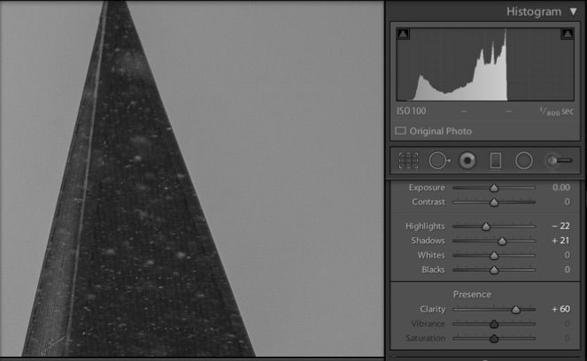
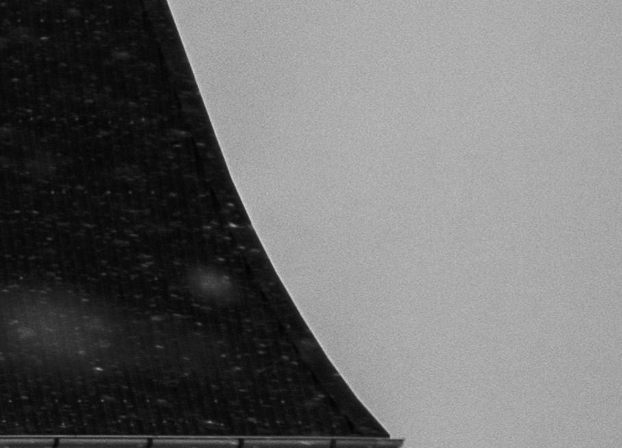
But, we can not overlook the seductive tools in Lightroom - namely the Highlight and Shadow and Clarity (shudder.....) sliders. These three are often over-used simultaneously creating enormous masking lines around objects (such as people, mountains and trees) when the files are exported for printing.
The sliders used to adjust this steeple are not severe and yet when you look at the resulting output in Photoshop in the next illustration - you can plainly see the masking line that was produced. Certainly too much Clarity is involved. But this making line will print like a sore thumb and prevent any more image sharpening from being used. This line would only grow with pixel sharpening.
So let’s take it from the beginning - as a best practice - some basics in Image Editing in Photoshop. And remember - there is nothing that you NEED to do. There is no you should do this and do that and then this and that. We do not prescribe to boiler plate imaging. Every image is unique. And further, Piezography is different than regular inkjet printing. You may wish to see your raw images first. You should - prior to adjusting them - unless you have already developed your own personal vision and you have a way of editing images that you wish to continue.
Once a file is opened it can be converted to black & white in any of a number of ways. The easiest is to convert from color to grayscale. It is not destructive. You will end up with gray information that is no different than desaturating an RGB color file. The grayscale conversion is 1/3 the size of three channels that contain the same information as the grayscale conversion.
You could also convert to grayscale using a mixer or a filter. You could also keep the original image in color and use conversion layer in Photoshop as a black & white layer or saturation layer. At this point, you really must make a Proof. Until, you can believe your display is 100% calibrated and matched to your output - you should begin the habit of editing your images based not upon the virtual world of Photoshop and Lightroom - but the plain, stark reality of Printing. You can refer to the workflow later in this guide to understand how to print. This section assumes you already understand how to print with Piezography.
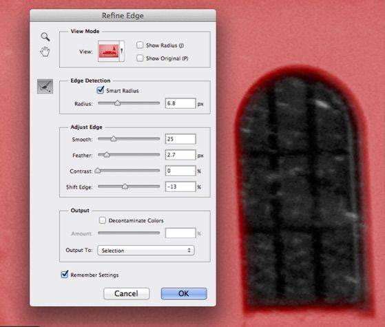
The use of curves and levels can be accomplished with layers in Photoshop. And these can be masked layers. I believe that the use of Refine Edge... will allow you to make selections for local adjustments that will not leave behind artifacts and are quick and easy to make. What Refine Edge does is take the place of the Feather option when you make selections. The tool allows you to control how a mask is feathered. But, it is so much more. It also controls the smoothing, expansion, and contracting of the selection (visually). It also incorporates edge detection. It is the mask making took of all mask making tools.
Many people still painstakingly paint their masks. Often a simple lasso tool with Refine Edge will produce less tell tale signs of masking. A tell tale sign of masking is any mask that we can detect or figure out was there in the Print. Your goal should be to leave no evidence behind. Piezography makes that more difficult and will make you a better imager for it.
Masks should not be overlapped unless they are the same mask. In other words, do not create a mask for an object and then recreate the mask for the same object. Where they overlap usually some evidence is left behind. It is a better practice to copy a mask from a layer by using the Command (Mac) or Control (PC) key and clicking the mask. This turns the mask in that layer into a selection. You can add to and subtract to selections. Selections are masks. Masks are selections. You can view a selection as a channel and edit from the channel. There are so many ways to deal with masks and selections and to do so efficiently and with finesse. You can create a new adjustment layer from the copied mask (selection).
I tend to use a drawing tablet and paint in my masks very carefully - the soft brush strokes are very difficult to see in the Print. However, I rarely paint in harder edged masks. I prefer to create a selection and then refine the edge so that it does not show. Later, I will edit existing layers with a brush adding or subtracting from them if I feel the need. I always want to avoid producing an “edge”.
If you produce broad adjustment layers - you should name them as to what they do. If these are localized adjustments, you should name each layer for efficiency and organize them into groups so you can easily relocate them. In the workshop if possible, we may look at an image file I produced for photographer James Nachtwey that is nearly 2.3GB in size. It comprises hundreds of layers. James is a well known war photographer who shoots for Time-Life and it is not permitted even by his own ethics to alter an actual photographic image. Therefore, each and every adjustment that I make to his film must be documented to prove that no alteration has been made. Every dodge, burn, lighten, darken, dust removal, you name it is recorded on a single layer. So the organization of these layers becomes important - and yet with a work in progress it is not often easy to think methodically. But, it is a best practice.
Later, when you are re-editing based upon a proof - you can find the adjustment layers quite easily. And if there are adjustment layers that you have turned off, you might consider color coding them just so that you know that any “red” layers (for example) should be off.
In my practice - when I make a selection/mask that I intend to use with several adjustment layers - I will save this as a selection layer without any adjustments actually made. I can then use the mask for subsequent layers. In order to show that it is a layer holding only a mask - I will color code it. I used Red for a turned off layer - as a warning. For a mask only holding layer - I may use something like “blue”. The point is to stay organized.
But, yes the file grows with each successive layer. And your skills grow with each successive layer. And eventually, you may find that you can do with five what you used to do with fifty.
I tend to do overall adjustments first. These are for basics such as Contrast, Exposure, overall Levels or Curves. I tend to prefer Curves because Curves have more control. Where Levels offer only three adjustment points - Curves offers 13. Curves can offer what Levels can. Levels can not do what Curves can. The Curves dialogue is one of the easiest of the Photoshop tools to understand and control.
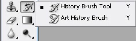
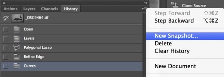
I use History Brush especially in combination with a History Snapshot after executing a Curve (saving the History Snapshot, then canceling the Curve, and painting with History Brush from the saved History Snapshot.)
The best Options to use with History Brush are Normal, Multiply, & Screen each using a % of Opacity to control the effect. Normal uses that % of Opacity to apply the effect of the Curve onto the image. Multiply acts to darken the image to that amount of Opacity. And Screen acts the opposite way and lightens the image. I use Multiply and Screen as my Burn and Dodge tools because they work better than Photoshop’s Burn and Dodge tools in that they are less destructive and they are more sensitive.
Once you begin painting your corrections in this manner - it should lead you to painting your masks in Layers. Painting always is a preferred manner because with some skill, no one will ever know you’ve touched your files. At some point - you must become aware of the brush Hardness in that it can easily give away your good work. It is important that the brush not create a pattern that is easy to spot. This is especially important in images that have been scanned. A brush that does not match the integrity of the grain will produce trails behind it. So you need to be aware of this.
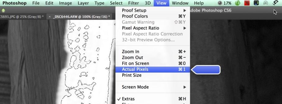
Actual Pixels View!

This is the only view in which you can review your work. Any view less than Actual Pixels View is what is called a proxy view in Photoshop. Photoshop is doing some amount of averaging in order to display your image when it is in proxy view because it can not map one image pixel to one display pix-cell. While you can not possibly see but a small portion of your image in Actual Pixels View, what you see is what you get. If you see artifacts at this % of view - these artifacts will print!
Can you edit your image in this view? No. This is for checking your work in which you are making or using masks and using brushes. Most importantly, this is the only view to use for Image Sharpening.
Do You Need or Want Black?
That may seem like a strange question to ask. But, the reality is that we are conditioned to “need” black by a long history of silver printing in which near black is difficult to achieve. Piezography has many additional Zones of information that have significant detail. We think more of iDmax instead of dMax. Where is the last bit of dark detail?
On the other hand, some photographers find nothing of interest in the shadows. Richard Avedon told me once (not really name-dropping here) that absolutely nothing interesting happens in the shadows. That is totally one man’s opinion and he is not some kook on the street. But, it is as significant a statement as any. Yet, my belief is a total opposite and I spent most of my professional life trying to achieve all kinds of interesting things in the shadows.

Whether you prefer shadow detail or not, Piezography does not produce black at any pixel location other than L0. L1 is actually lighter. On the other hand, the Epson RGB and ABW drivers produce black in L values as high as 10 (sometimes even higher). The Epson driver can not achieve significant shadow detail because it does not have enough dilutions of black ink and there are not enough divisions of gray to express near black.
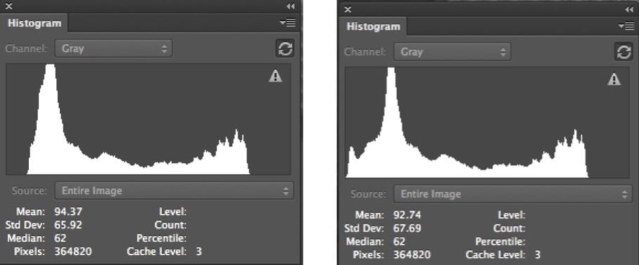
It is conceivable - nearly probable - that your image files may not have any black pixels. Or, they may have too few to be significant. How you can tell is by reading the Histogram.
In this particular Histogram on the left, the pointer is over the L0 level and reveals 6,678 black pixels out of a possible 24,000,000. That is a very small amount of black pixels. It may be enough - it may not be enough. That all depends on whether you Need or Want a lot of Black!
If you have scanned your images flat, a Histogram like this would be expected. You would be expected to bring black and white in as you require. It is not something that you automatically do.
Were you to photograph a seashore in absolute foggy conditions, you would not expect to photograph any white nor any black. You would have a lot of different grays. If you wanted to print it so it looked naturally, you would not bring in any white nor any black.
But, in a more normal contrast scene where some black and white are expected. By white I imply specular white. You may wish to have some specular - you may not. Black on the other hand seems to be something that photographers are less willing to give up. It’s a habit, nearing addiction in how widespread it is. We are conditioned nearly as much by black as we are by over-sharpening (some tongue in cheek....).
The purpose of this section is not to talk you out of black. We love black. Rather it’s to give you some guidance and instruction on how to achieve black with Piezography.
The conventional wisdom is to use the Levels tool to bring the end-points in. That does work...but...it also affects the rest of the image by equalizing it a bit so that more than just black is brought in; the shadows become darker and the mid-point may as well. If that is not your intention, you then need to control this process.
You can use Curves instead and hold the areas of tone with a point so that they are not affected.
Sometimes, you need to use the image to make a mask so that you can just hit the touch points you want with a little black - like an emphasis. How you go about this can be done in a number of ways. How we do it as an example will also give you a new tool to make all kinds of local adjustments. The same technique can be used (for example) to correct blown out clouds.
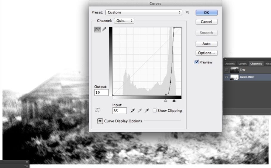
This is old school image masking. And in this example, we will use a grayscale image to mask itself. Here is the step by step.

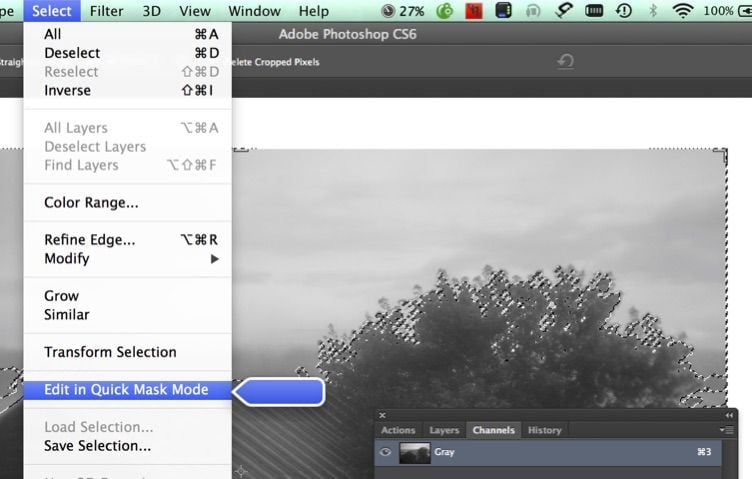
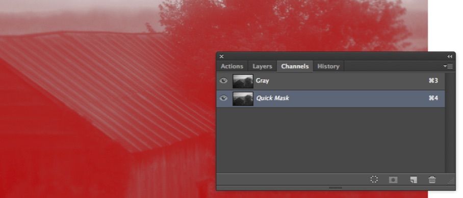
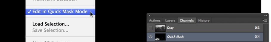
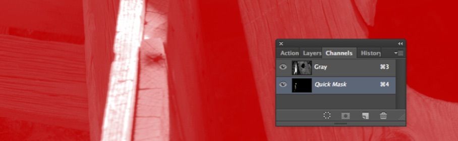
1) Click on the Load Channel as Selection to create a selection that is a copy of the Grayscale channel.


2) Edit in Quick Mask Mode. You can also type the shortcut command of Q to go in and out of Quick Mask Mode. This creates a temporary channel the same as the selection.

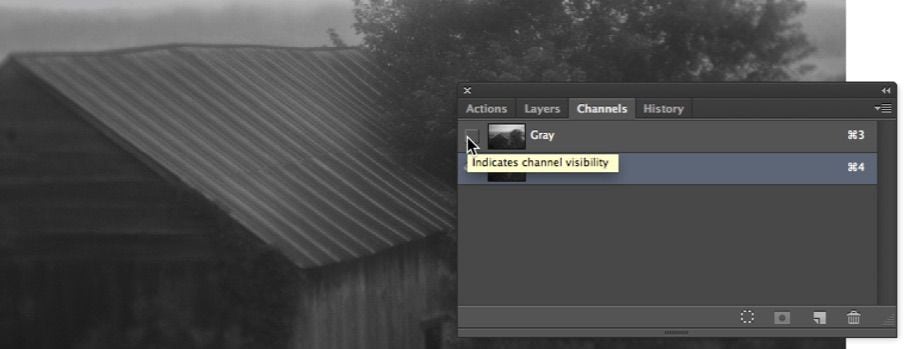
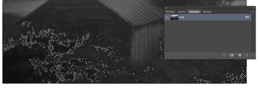
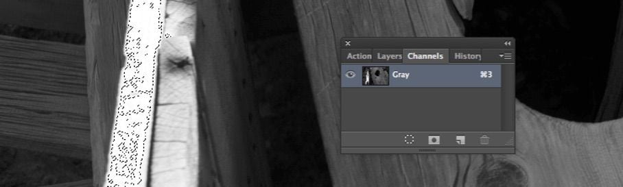
3) The Quick Mask channel looks like a traditional Rubylith mask overlay. You need to turn off the Gray Channel.

4) With the Gray Channel toggled off - the red mask preview is disabled. Now the channel that is selected is the Quick Mask. And it looks just like the Gray Channel from which it was sourced. This is a selection that now needs to be modified. In this example, a selection that contains only the shadows is desired. Curves, Levels, careful use of the Eraser and Brush Tools, Dodge and Burn...everything is in play in order to make the selection required.

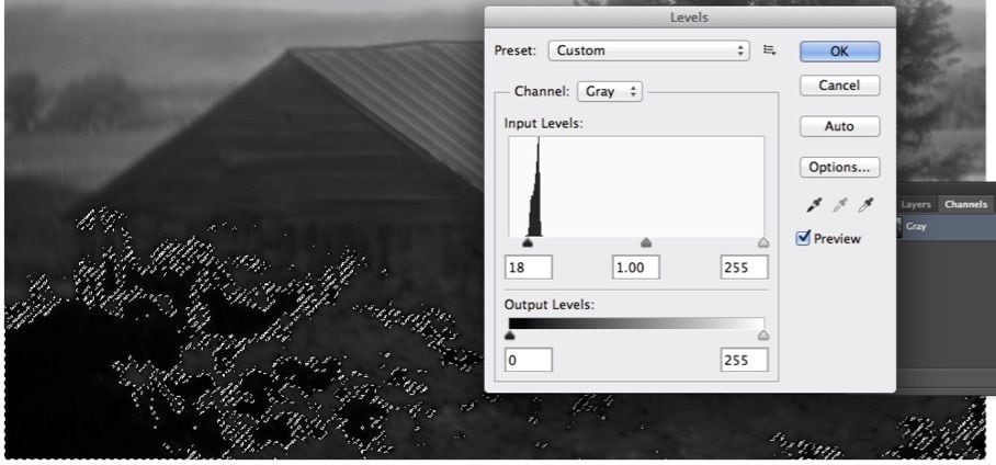
5) A Curve is used on the Quick Mask Channel to eliminate most of the information other than the darkest shadows (where we want to touch with some black while leaving the rest of the image untouched.)

6) Levels is used to reduce the mask further. Some of the lighter area is left behind to soften the mask. You could Erase or Dodge anything else you want removed from the Mask. The next step will be to invert the Channel.
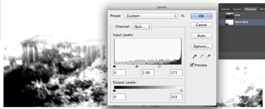

7) The Quick Mask Channel is Inverted because Selections are white and masked areas are black. Now the channel is a proper selection that incorporates only the darkest areas of the image.
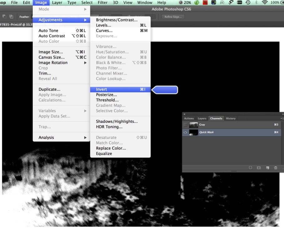
8) Now turn off the Quick Mask Mode or type the shortcut “Q”.

9) The Quick Mask Mode and the Quick Mask Channel are both turned off and area that was edited with Curves and Levels is now the Selection.

10) Difficult to see in reproduction here - but only the shadows in this image are touched to black with a little bump in Levels. The Levels histogram is restricted to the Selection. This adjustment is usually made using Actual Pixels View so that you do not crush the shadows. The idea is a bump.

11) The Selection is turned off by deselecting it. The Histogram on the left is the actual Histogram of the image now. The Levels dialogue is open only to show that its histogram is the same as the image Histogram.
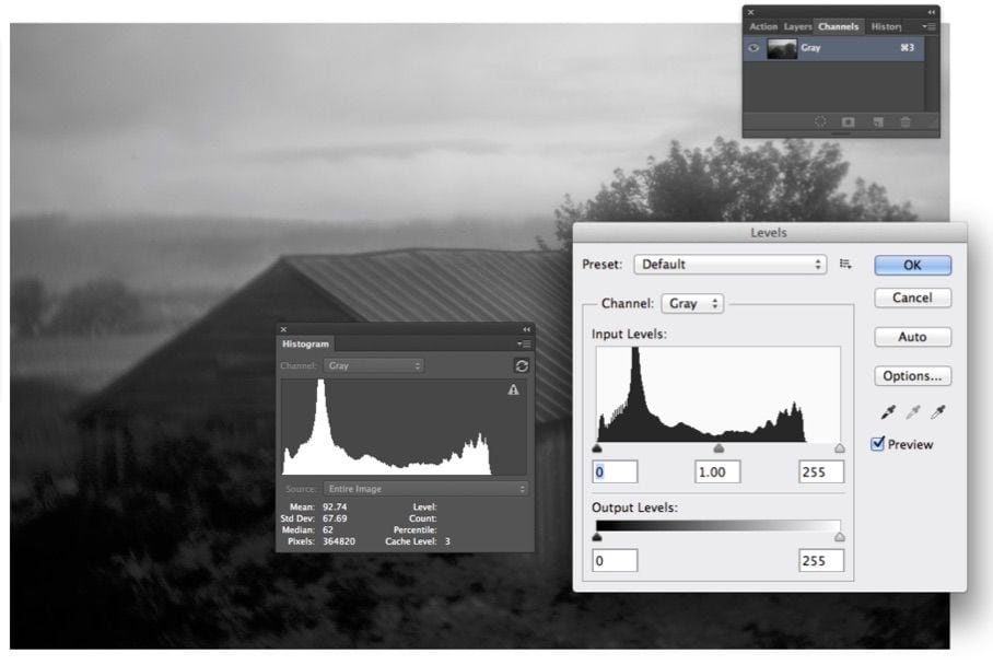

12) This technique bumped the shadows without affecting the 3/4 tones and mid-tones. So what about the other end of the Histogram? What about it? There is absolutely no highlight in this foggy landscape. This part of the Histogram is fine as is. There is no rule that Histograms need to be equalized other than in a perfect world of full contrast shadow and sunshine.
How about the proverbial Histogram of a polar bear in a snow storm?

Where Are the Highlights?
Missing highlights are better than crushed shadows. Crushed shadows the result of gross underexposure are much more difficult to repair. But, missing highlights (the type that get blown out by over-exposure) are easier to repair. If I have to decide to expose for shadows or highlights - I go for the shadows knowing I have a better chance to rebuild the highlights. Having said that - a best of both worlds would be preferable if possible.
Clouds on a bright day are often impossible to hold when there is interesting shadow detail that one does not want to allow to become solid black. So, some bias to over-exposing allows the shadows to be captured at the expense of the highlights.
Here is an example:
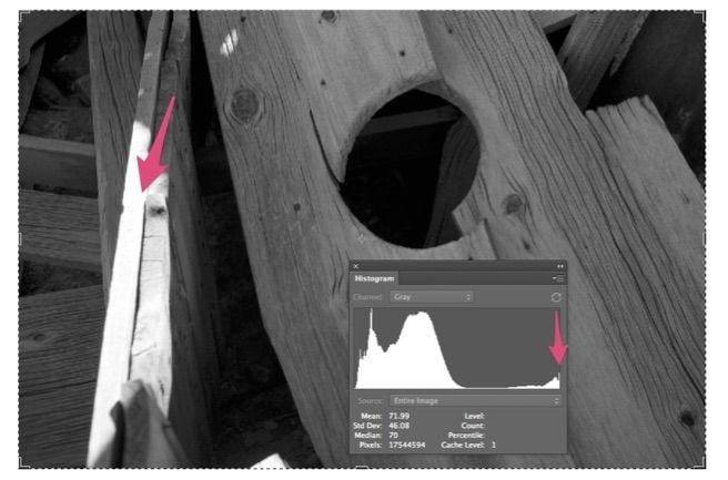
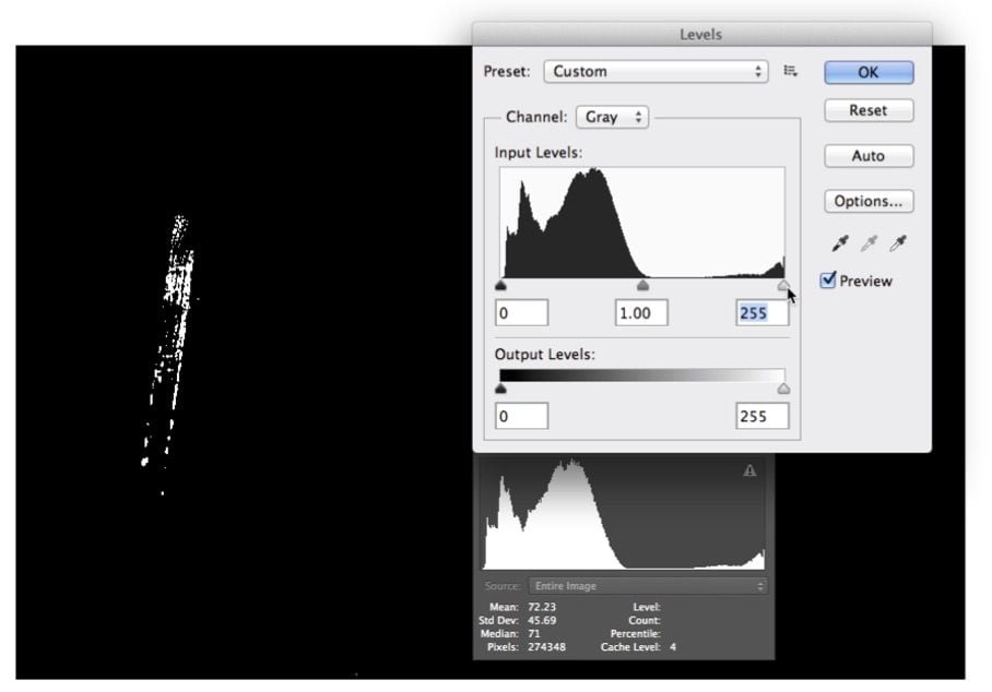
That little highlight spike at the right side of the Histogram indicates specular where I do not want specular. Another way to check for this is the ages old trick of holding down the control / alt key while clicking the end-point of the Levels tool.

You can use this trick for the black point also. It will show you all of your black pixels and you may be surprised how few you might have. But, in this case we are just confirming that we have specular highlight on the wood. The following exercise is how to repair specular when it is unwanted. It is very similar to the exercise in touching shadows. But, we will need to add noise and blur to the selection we create with Quick Mask.
Please look at the
Do You Need or Want Black section just previous to this section to find how to create a Quick Mask channel from the existing Grayscale Channel. That is where this tutorial will pick up. We will start by editing the Quick Mask Channel.

In the image below, am using a curve that allows some of the near specular information. The point I placed towards the top of the Curve allows me to soften the mask. You do not want to end up with a bitmap like threshold in the mask. This darker gray (as compared to the black) will still mostly mask out the near specular information. This particular mask will not need to be Inverted. The specular is already selected by the white areas of the mask while the black masks out the areas that will not be affected.


Turning off Quick Mask shows the areas that are now selected.

Turning Quick Mask back on shows the selected area through the mask. Get it? You can always go back and forth for editing the selection using the shortcut “Q” key on your keyboard.

Once you are out of Quick Mask, you will need to edit in Actual Pixels view so you can carefully see your work. The goal will be to “manufacture” pixels!

Also, hide the “marching ants” so you can see your work.

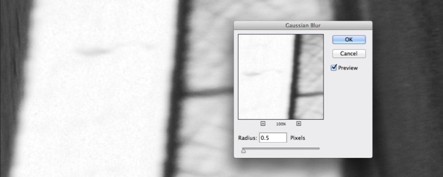
I’ve zoomed in 200% to try and match up some Gaussian Noise to try and imitate the adjacent image. Were this a scanned neg, I would be imitating grain. Were this a jpg compressed image, I would be imitating the compression. Here we have a smooth Sony A7R capture - so a little Gaussian Noise - followed by a little Gaussian Blur!
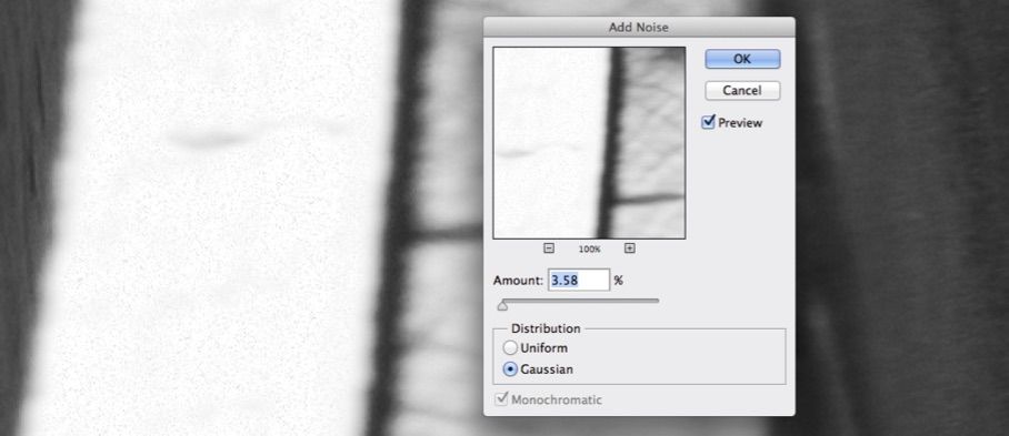

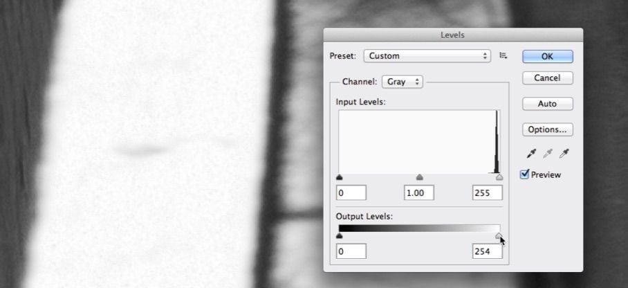
The blur is necessary to soften the effect. Now all is left is a little tone which we can bring in with the Levels tool.

Just a little Output Levels should complete it. Notice that the Levels’ histogram

Here is the Before. The After needs a touch more blur!
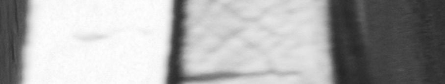
Image Sharpening
First of all, I believe that image sharpening is way over-used in digital printmaking. My opinion in seeing many prints is that the imager keeps trying a little more; a little more; until just too much; and then barely backs off a touch. And I’m not quite certain how or why this has happened in digital printmaking other than that it is a possibility that did not exist in the darkroom unless someone was skilled in making unsharp mask positives to contact print with negatives. Highly unlikely...
My opinion is that images today are so over-sharpened that they appear unnatural and unreal. I tend to print much softer than most. You must decide how you want your images to be viewed. Acuity is one thing. If I can afford glass that resolves more detail - I would not hesitate to use it. Sharpness is something altogether different, in that it can be applied to images that are rather low in acuity. And sharpening can easily be done to the point where it is painfully obvious in Piezography.
The EPSON RGB and ABW dither tends to just break up some over-sharpening. The Piezography K6 and K7 curves print with much higher resolution so as to reveal over-sharpening.
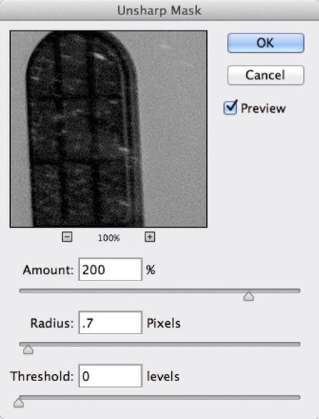
Because sharpening is easily revealed visually on the display, you should simply sharpen to that amount you wish using Actual Pixels View. It’s very simple to see what is too sharp, not sharp enough, or just right.I happen to use the traditional Unsharp Mask filter because it is both straightforward and easy to master.
The basics of it are that you must define the pixel radius. Generally speaking you will most definitely see the sharpening lines with a radius over .8. I use .7 so that anything I slightly oversharpen will not reveal contrast lines. The Amount is the intensity with which you wish to sharpen. I can sharpen as high as 250% with a Radius of only .7. Threshold is a smoothing routine in which anything more than 0 will allow some smoother parts of your image to escape any sharpening. The higher the Threshold the more that remains smooth. The Threshold is related to the difference in gray values.
I tend to not use this feature. But, if you wanted to not sharpen skin while sharpening hair, you could use some Threshold to allow the skin to drop out. Anything of continuous smooth tone can be avoided by using Threshold. Areas adjacent to each other of higher contrast will be sharpened when Threshold is used.
You do not need to see your entire image on display to know how sharp it is. You really can’t tell in a proxy view. You need to see the actual pixels in Actual Pixels View. Sharpening is usually done as a last stage. On scanned images however, I would sharpen before you dust and scratch because sharpening brings out the dust! On digital images, I usually flatten the file, apply my sharpening, and Save As the printing file.
I do not use more or less sharpening for smaller or larger images. I am of the belief that at pixels view, the image is either sharpened just right or not. On the other hand, I do not prefer a great deal of sharpening. So, your experience may be different.