Table of Contents
- Overview
- Dynamic Luminance Detection
- Variable Patch Targets
- Special Averaging Support
- Measurement Smoothing
- Falses Correction
- Start Points
- Channel Curve Smoothing Tutorial
- Variable Ink Limiting
- Target Luminance Calibration
- Contrast Tweaking
- Channel Remapping
- Curve Blending
- Curve Inversion
- Save a Copy
- Physical Ink Mixing and Blending
- Repurposing Clogged Printers
- Ink Placement Charts
- Initial Fill Instructions
- 1400/1430/1500 Instructions
- P400/R1900/R2000 Instructions
- R3000/P600 Instructions
- 3800/3880/P800 Instructions
- 4000 Instructions
- 4800/4880 Instructions
- 4900 Instructions
- 7600/9600 Instructions
- 7800/9800 7880/9880 Instructions
- 7890/9890 Instructions
- 7900/9900 Instructions
- P6000/P8000 Instructions
- P7000/P9000 Instructions
Piezography Manual
Grayscale Management
Overview
This chapter was originally written for The New Piezography Workshop Manual given in printed form to each lucky attendee of a Piezography workshop at Cone Editions in Vermont. A few paragraphs may mention the workshop curricula and workflow but it all applies to real-world users so we decided to include it in this manual. We teach Piezography and PiezoDN workshops regularly at Cone Editions. You can get more information at www.cone-editions.com!
Grayscale Management
The ability to grayscale manage images has been largely ignored by the imaging community in favor of managing tonal values with color inks and using color management.
Grayscale management, has largely been undocumented in our manuals - although always mentioned. I have not necessarily named it as Grayscale Management. But, calibration is talked about frequently. Calibration and Grayscale Management are not the same. Calibration is a part of Grayscale Management.
The main difference between grayscale and color management is the absence of a color output device in the former. Color management always assumes output to color printers or some reproduction device that uses RGB or CMYK color inks. It can also mean output to display - and that is equally important. Not many applications today consider output to non-color devices. Photoshop still considers output to grayscale devices. Adobe has strongly considered grayscale output since as far back as I remember, and I go back to version 1.0.
In version 1.0, the output device was the black and white bitmapped screen of the early Mac. There was not yet a color Mac. Next, Apple considered carefully how to output to the Laserwriter pinter. The Laserwriter printed with a Gamma of 1.80 and Gamma 1.8 and the Macintosh operating system were married while the rest of the PC world operated in sRGB and Gamma 2.20. This was a happy marriage throughout the late 80s, the 90s, and into the early 2000s until Apple met LCD. LCD was sexy - she had a Gamma of 2.2.
Apple switched gears but the rest of its operating system did not quite catch up to its best-of-intentions-but-ill-executed plan. Adobe was steadfast. Adobe set Dot Gain 20% as its default for black ink only offset printing, but allowed unlimited and unfettered access to any custom grayscale output device creation that the user could devise by customizing the gamma or dot gain. Adobe did something similar to its CMYK output engine and that was how Cone Editions was able to match the IRIS output prior to the invention of ICC profiles.
What the Adobe grayscale custom output devices did was change the way Photoshop displayed the grayscale to the viewer. You were able to see what you were going to print by making a custom Gray working space using either a gamma curve or a % of dot gain box. Of course you’re going to go for the curve! Lots of points to modify and adjust. The dot gain was an actual compensation percentage to how much darker a dot of ink would get as it was absorbed into the paper. And in CMYK, you had and still do have access to the actual press inks and the color mixes they form in addition to dot gain.
This took a huge personal knowledge base in how to do this stuff and this is what set Cone Editions and Nash Editions apart from the rest of the IRIS Gicleé studios. Both studios had their own custom software to manage output.
Piezography is the direct result of the work that was being developed at Cone Editions in the early to mid 1990s in which both custom software was developed as well as the first archival inks were formulated. Cone Editions first began developing color archival inks. The second formulations were purely monochromatic and the Digital Platinum for IRIS systems were introduced at Photo Plus in 1998. Ages ago now...
But always in Cone Editions history of printing for photographers, the image could be previewed correctly on the Photoshop display. That is grayscale management of grayscale photographs. Photoshop editing occurred in the same working space as the output device. The display device could be calibrated to imitate an output space in Grayscale and also in CMYK (for the IRIS printer). RGB could only view input spaces until the ICC profile was invented and incorporated into Photoshop for “Soft Proofing.” Now in Adobe photo editing software, an ICC profile (measured from the Piezography inks on paper) can be used to change the appearance of an image on the display to match what it would look like printed. This is the Soft Proof (a software produced version of a printed result).
When Apple met LCD, I decided to convert Piezography from a Gamma 1.8 grayscale profile driven system to a Gamma 2.2 profile driven system. At this same time, we decided to use the QuadTone RIP driver as an interface to it rather than our own software. The profiling applications that we produced were updated and we produce a proprietary curves format that is then compiled to work with the QuadTone RIP driver - even as they are not made with the QuadTone RIP curves tools.
Apple would prove to spoil some of the party eventually. It lost all interest in Gamma. It began to focus internally ignoring what the external world looked like. Adobe tried to intervene with its own tools, but Apple successfully rid itself of any manual color management trying to use its operating system, and instead incorporated ColorSync directly into 10.4. At first it was good.
But in subsequent versions Apple began substituting Generic RGB as a color conversion space when it could not find an output device ICC. Apple assumed that images that were untagged must have been previewed on Apple displays. How selfish to think so. Pros have been struggling in one way or another ever since unless they are relying solely on ICC.
Piezography does not use output ICCs when it prints. This became a problem. Apple does not recognize Gamma 2.2 as an output device - because it is not. It is an input device. The QTR Printer is not an output device that uses ICCs. We calibrated to Gamma 2.20 because that is the gamma of an LCD display. And our output imitates this gamma.
In order to print Piezography there can be no disruption or conversion of the image file’s smooth grayscale data. Apple was converting these untagged (no output ICC profile) image files in nearly an abstract manner. So, a method to specify no color management (do not convert) therefore is required that will not trigger the Apple function of supplying and converting to Generic RGB. Apple removed that from their internal libraries and there was no way for Adobe to access it.
Adobe released a printing utility that could find a way to disable the internal Apple file conversions, but Apple subsequent OS release interfered with the no color management functions of both the Adobe Utility and also the QuadTone RIP. QTR released Print-Tool and the No Color Management function holds - because the QTR driver is used and an output device is being managed as far as the Apple OS is concerned. No conversion takes place. And QTR does not use an ICC profile. Peace was restored.
This is background to why Grayscale Management is so important. Most would never think that an operating system might be converting grayscales into darker or more contrastier or lighter or oddly converted images prior to printing. Rather, they would be scratching their heads trying to figure out why their printers were behaving so oddly or could not come close to what they were seeing on their displays. Grayscale Management closes the loop between previewing and printing.
Grayscale Management is a process in which the operator gains control of the process in which an image on a display can be made to match the output. It also assumes, that the operator is gaining control of the various devices and the environment in order for this process to be both dependable and repeatable. This process necessarily includes software, hardware, and the environment.
Gray Gamma 2.20 Overview
Piezography is designed around the concept that an image can be linearized in a non-scientific way. And by doing so, Piezography is unique from other QTR derived workflow as well as other linearized output including that of the Piezography supported StudioPrint RIPs.
Gamma is not much more than a mid-tone correction to output that changes the contrast. The main reason for using a Gamma correction is to enhance the contrast to make a grayscale appear more pleasing to the human eye.
Linearizing grayscale output from dMin (paper white) to dMax (darkest black) is much easier and very straightforward when there is no Gamma correction as in the case of Gamma 1.0. But, we do not see the world with a Gamma of 1.0. And we do not use computers that display in Gamma 1.0. We use computers that display mostly in Gamma 2.20.
Yet linearizing smooth output that is adjusted to Gamma 2.20 is computationally intense. As far as we understand, Piezography is the only system in the world that linearizes the output using a Gamma of 2.20. And further, this Gamma is slightly modified to further open the shadows and produce intricate detail in highlights.
You must image in Gamma 2.20 and you must save your images for printing by embedding a Gamma 2.20 profile. Both Adobe RGB (1998) and Gray Gamma 2.20 use a Gamma of 2.20.
Because the Photoshop Color Settings have been set to Adobe RGB 1998 as the color working space, this sRGB embedded image file is triggering the Embedded Profile Mismatch warning. We can easily turn off this warning and simply have the image files automatically converted by unchecking the Ask When Opening boxes in Color Settings’ Color Management Policies.
Convert to Gamma 2.20 Working Space
Earlier in this guide we showed you how to setup Photoshop and Lightroom so that images were Saved or Exported in the correct workspace required by Piezography. Gray Gamma 2.20 or Adobe RGB 1998 both have a Gamma 2.20.
But what about legacy images? If you have never altered your Photoshop Color Settings, then all of your grayscale images will have been saved with a working space of Dot Gain 20%. This is the Photoshop default. These images will need to be converted. If you setup your Photoshop Color Settings as we directed, this conversion will occur automatically.
A dialogue window will come up when you open a non-Gamma 2.20 file in Photoshop that looks like this:
A dialogue window will come up when you open a non-Gamma 2.20 file in Photoshop that looks like this:
Because the Photoshop Color Settings have been set to Adobe RGB 1998 as the color working space, this sRGB embedded image file is triggering the Embedded Profile Mismatch warning. We can easily turn off this warning and simply have the image files automatically converted by unchecking the Ask When Opening boxes in Color Settings’ Color Management Policies.
This type of file conversion is totally non-destructive. What it does is preserve the last display preview in the new working space. This means that the last time you looked at a non-Gamma 2.20 file in Photoshop - it will look the same in Photoshop after it has been converted to Gamma 2.20.
If a legacy image does not have an embedded profile ( a no no), you should try and investigate what is the likelihood of the working space that you edited it in. These are controlled by Color Settings. If you never changed any of these settings, you might suspect then that the image was first edited in Dot Gain 20% if its a grayscale or sRGB if its a color Grayscale. In this case you must first assign the correct working space (profile) to the image and then convert it to the working space.
That Profile Mismatch warning will look like the following:
That Profile Mismatch warning will look like the following:
In both of these cases, the image is converted to Gray Gamma 2.20. Recall that we set our color working space to Adobe RGB 1998 and our grayscale working space to Gray Gamma 2.20. Both use Gamma 2.20.
The Output Device
This is not just the printer, but rather the entire Piezography printing system. The system includes the printer, any of a number of supported media, the printer driver (QTR), and the printing inks (Piezography).
In order to properly grayscale manage the output device, it must be standardized (achieve a condition that is repeatable as well as default). A system that includes so many adjustable settings and possibilities must be stabilized to a standardized set of settings (in the printer driver and print dialogue windows), the ink densities, the media, and the printer condition.
In Piezography, we consider this carefully and devise an output profile for each media based upon these standardized settings. The ones we have chosen are No Color Management, 2880dpi, uni-directional, No Advanced Adjustments. And these are the settings you must use when you print with QuadTone RIP.
Then of course, the actual condition of the printer is critical. It’s pigment inks must not be contaminated nor allowed to fall out of suspension. The print head must be in peak condition. None of this happens by chance, but rather by deliberate preventative maintenance.
The Printer Environment
We really need to consider also the environment of the printer and this includes its condition. The device must be standardized as just mentioned. However, the printer is affected greatly by relative humidity and temperature.
It may not be obvious, but humidity affects two things. Too little affects the ability of the print head to emit droplets of ink. In fact, it is often the cause of “clogs”. Too much can cause the print head to over ink. Likewise, too little and too much affects the inkjet paper ink absorption. What is best is to control the humidity and temperature.
The Input Device
The LCD is the dominant display device on the market today. A decade ago, it was the CRT (and its native Gamma 1.80). The primary differences between these devices besides technology is that they differ sharply in their generic white points (color of white in kelvin) and gamma (a mid-tone compensation curve).
As mentioned, before 2005 Piezography printed a grayscale contrast that looked like an input gamma of 1.80. In 2005, when we released Piezography K7, we made a significant change to how its output appeared. Instead of producing smooth grayscale tone that emulated the input space of a Gamma 1.80, it now produces smooth grayscale output that emulates an input gamma of 2.20. Not exactly gamma 2.20 - but a modified gamma 2.20 to just slightly further open the highlights and shadows to get the last few remaining gray separations distinct. L values 254 to 1 are now the iDmin (first printed detail) and iDmax (last printed detail).
And in all current Piezography systems from K6 to Digital Negative to the upcoming (or if released by this printing of this manual) PRO, the output is expected to produce a linearization that is based upon our own characterization (this modified Gamma 2.20).
A typical LCD is preset to Gamma 2.20 and is sufficient to use as a contrast gamma between display dMax (the darkest) and dMin (the lightest) with that of the Piezography dMax and dMin. While the display is usually of exceptionally greater dynamic range (difference in luminosity values between dMin and dMax) unless Soft Proof ICC profiles are employed, the contrast ratio between that extreme and that of the Piezography print can be made to be of the same ratio. It is not easy for most people to look at a very large dynamic range and a very short dynamic range and see the same contrast ratio. Often they confuse in their head that the blacks are not the same and the whites are not the same.
And they can not be unless Soft Proof ICC profiles are employed. The dynamic range of a display includes an intense backlit brightness for its white - while the print relies on the reflection of light to illuminate it. The black is often as dark as 3.0 - 3.8 on a display, while the black ink on a paper print is catching much of the reflection of the light that is illuminating it. The black ink therefore has a measurable dMax much less than 3.0. Rather, for most matte prints it is around 1.65, and for glossy prints it is rarely higher than 2.70.
What is similar in the Piezography workflow without further calibration, expense and / or adjustments is that the contrast gamma between dMin and dMax is the same on the print as it is with the display with respect to the middle gray value. Both, have a gamma corrected contrast ratio of 2.20.
In terms of LCD displays, they differ remarkably from one another. Salesmen and LCD reviewers will say that the best displays are the brightest. That is like saying the best automobiles are the shiniest ones or have the most chrome. And for some this is actually true. A stainless steel Porsche with chrome wheels would certainly be preferable to a matte black Chevrolet Spark. For others, the best cars will have the most luxury. Still others will consider performance, or room for kids and for a dog that can not get into the groceries cargo area. There is no one best car. But, the same can not be said of LCD displays in regards to Print.
The best LCD is not the brightest, but the one that is best at displaying Gamma 2.20 at a very low brightness setting and displaying the entire range of 256 distinct gray values. Tall orders.
What to look for in the display is something similar to the displays that we encourage you to plug your laptops into at the Cone Editions Press workshop room. These are special LCD displays with internal 14 bit per RGB channel color engines that can directly be adjusted via calibration to the best possible 8 bits per channel while the display board of your computer is left untouched.
Conventional displays are only 8bit per channel and calibration packages such as Spyder or Munki must adjust the display video output of your computer to make the LCD seem its appearance has been changed. And that is a very big compromise even though Datacolor and X-Rite do not mention that. From their point of view, it is both better than doing nothing, and with the advent of the LCD it is actually all they can do. The demise of the CRT took with it, the ability to adjust the actual video engine of the display.
Naturally, the 12 to 14bit displays are more desirable because having less than 8bits (256 gray values) per channel video output on your computer affects the ability of your computer to smoothly display ICCs as well as image corrections. Photoshop curves and levels are used to adjust 256 gray levels per color channel. But, if Photoshop can no longer display 256 gray levels per channel, I would argue that your ability to make very fine changes that you can simultaneously see occur on your display is sharply compromised. And for many this may not be a problem - especially if they begin to image by the numbers (RGB pixel values using the Info palette.)
8bit color is also called 24bit (16.7 million colors) color in some strange twist of the universe. Those who think per channel (8bits) consider it the same as those who think in RGB (8bits x the three video channels of Red, Green and Blue). That would make 16bit the same as 48bit - but you hardly ever hear or read that.
Calibrating a video board (that only has 8 bits per channel or 24bits in total) will reduce the output of grayscale separations. How much? Can be a lot. 24bit color is 8x8x8. 256x256x256 = 16.78 million. Using a calibrator to calibrate your video board might produce something like 170x178x248 = 7.5 million colors.
That all seems like more than enough because who can see that many colors, or who needs that many colors. But, what it disrupts is the ability of the display to differentiate between 256 gray levels. It reduces to the lower denomination and some apps try to dither in order to produce the others that are missing. 170 grayscale separations is not enough for Piezography and dithering gray values is not a very precise way to image in the 21st century. In terms of imaging, displays were superior in the 20th century (as far as professional imaging was concerned as well as color management.)
The displays in the Cone Editions Workshops classroom are either Eizo CG or NEC Spectraviews. These are using either the Eizo Color Navigator software with an X-rite colorimeter (but not X-rite software) or the NEC Spectraview II Software with the NEC or X-rite colorimeter (but not X-rite software). For these types of displays, you will need to disable any color management in your laptop and download the Eizo or NEC Spectraview software.
These displays should be calibrated specifically to Gamma 2.20 with a brightness of about 85 and a whitepoint temperature of 5000k to match the studio’s soft-proofing viewing booths. Before calibrating them, allow them to warm up for 30 minutes. When you are done, you should feel that you took a perfectly bright beautiful display and converted it into a dim, dull boring display. You will soon learn this newly converted display will be the life of your printing party.
And it’s critical to your understanding to realize that even though you may have used a ColorMunki colorimeter - you did NOT use the ColorMunki software. To do so, on this classification of display would have defeated the entire purpose because ColorMunki can not actually calibrate any display. It can only calibrate your video board to make the display reach the target - with the hit that I earlier described to your video board.
The D50 Environment
Oh boy is D50 old school and out-dated. Not certain you will see this in other workshops today in the modern era of DataColor or X-Rite sponsored workshops. And D50 goes against both logic and what is being taught. But, it does not go against human physiology.
D50 is the Calibration Standard from the days when tens of thousands of people printed what they saw on their displays. It is based on Gamma 1.80, but we will modify that for Piezography. It is based upon a white color temperature of 5000k and we should not change that as tempting and easy as it would be. Nearly all LCDs have an internal display of 6500. The displays you will be using in the workshop do not differentiate between white point preferences. There is no penalty to selecting 5000k. Converting an LCD to 5000k by calibrating your video board would necessarily reduce at least two of the three video channels to about 170-180 gray values from the standard 256. That is not the best practice! And the reality is that it contributes now to the adaptation of 6500k as appearing more “neutral” or “normal” to the human eye. And that is physiologically not possible.
5000k is, as you probably know, the temperature at which the ICC profiles make their color conversions (for a good reason). But, it’s importance is in the discovery made by the International Commission on Illumination (CIE) in 1931 when human vision was first mapped. The CIE discovered that humans see equal amounts of red, green, and blue light at 5000k. 5000k is therefore “neutral” to humans. Contrary to being considered warm to humans, it is only warm in relation to cooler light sources (such as 6500k). Humans are best suited to distinguishing the difference between adjacent colors when compared under 5000k illumination.
The D50 environment is purposely dim to about 35-50Lux. That is not a very bright room. If both light banks are off in the workshop room, this is approximately the D50 environment. How close is your working environment? Generally 35-50Lux is the amount of combined light from the display and a dimmed viewing booth that is placed adjacent to the display.
But the D50 environment also considers the room itself. The walls must be white or neutral and the user must not wear colorful clothing and there must be no other light source in the room other than 5000k. Humans can not adapt to more than one white point. Humans can not look at 5000k, 6500k and 3500k and see them all simultaneously as white light. But, they can look at any of these white points individually (in the absence of any other differing white points) and see “white” light.
The D50 environment is focused purely on 5000k light - the natural and neutral color temperature for human beings. The walls must not color this. The operator must not wear clothing that can reflect the light coming from the display back to it as a colorized reflection. Sounds sensitive? It is - if you are imaging for a $100,000 Channel ad campaign. You would not want your cadmium red shirt to cause you to make the image file just a bit greener than it should be.
To sum this up. The D50 environment is a dim room in which the user is sitting facing a calibrated display while wearing neutral clothing in a neutral room that is lit only with 5000k lighting. The display is calibrated to 5000k white point at the same brightness as the viewing booth adjacent to it, but no more than 85L for print work. The gamma is set to 1.80 but in the case of Piezography we must set it to gamma 2.20. I suppose this is the new D50 - or Piezography D50. It is the best practice.
We try to offer you a workspace at the D50 environment. As tempting as it may be to turn on all the lights - please refrain. For practicality we will illuminate one side of the room for working with the printers and keep the other side of the room as dim as we can. When everyone is in agreement it is better to turn off all the lights.
The viewing booths should not be turned up brighter! The idea in Soft Proofing is to display the print in the same color temperature and brightness as the display. When displays are too bright in a dim room, they will not reveal shadow detail. And yes, if we calibrate out in the main studio where the lighting is much brighter - we will calibrate our displays to match the illumination level in the room. The Eizo and NEC software support this.
Once more... Why not turn up the brightness of the display? The reason is that the display should imitate the brightness range of the print. Ink on matte paper has a density range of about 1.6 and on glossy paper a range of about 2.5 - 2.7. Modern LCDs have a brightness range often over 4.0. So they are calibrated to the Print. Lowering the brightness increases the ability to see shadow detail on a display. In the days of D50, brightness was called Black Point. It was actually “darkness” that was being adjusted. And finally, the brightness level is in relation to the illumination level in the room. Dimmer rooms are better for humans and displays.
Display Calibration
This workshop provides hardware calibrator displays because it is not possible to adequately calibrate a laptop for use with Piezography unless a generalized display is acceptable. Likewise, it is not possible to calibrate a non-hardware calibrator display unless some compromise is acceptable - so therefore we do not offer ordinary displays. There is an entire industry built up (DataColor and X-Rite) who produce calibration packages for laptops and for non-hardware calibrator displays. But, we are trying to introduce the concept of best practices in display calibration.
How well do the alternative products such as Spyder and ColorMunki work? Those packages include software and a colorimeter. The colorimeter is attached to the display while the software limits the output of the computer’s or the laptop’s video display board. The result appears to be a calibrated display, but it is at the expense of 24bit color output. The output of the video board is limited by a color lookup table CLUT. Photoshop and its Soft Proofing capabilities are restricted and undermined - either slightly or more than slightly. The potential is significantly. Can you live with this? It is better than not calibrating. But, it is not as good as using a hardware calibrator display such as you will be using in the workshop.
The displays used in this workshop have built-in 14 bit color engines and the color management systems directly calibrate the display while your video board is allowed to be used with true 24bit color output. These displays have a communication access to their video controllers that ordinary displays do not. Anything else - is a compromise. Several of the displays in the workshop are sub $400 as refurbished NEC. That may be surprising - because many of the non-calibrator displays such as the new 4K displays can cost nearly $2,000.
There are currently two Brands of hardware calibrator displays. The Eizo CG series, but certainly not all Eizo displays, and the NEC Spectraview displays, but certainly not all NEC displays.
Apple does not manufacture any hardware calibrator displays. Their top of the line displays are about $2,000 and are wholly inadequate for print proofing. It is not about money. The 30” NEC in the workshop is $1,040 refurbished with 12 month warranty. Or it is $2,800 new with 12 month warranty. The Apple 4K displays are very expensive but are not a good choice for print work. The new retina displays are certainly not designed for printing. They are designed for looking at images on a display, and especially for working with video.
The choice of a display is a choice. eBay is a perfect venue for selling recently acquired hardware that is still very desirable. Consider carefully what choice you will ultimately make.
Not Spyder, nor ColorMunki, nor Eye1 can calibrate a non-hardware calibrator display without having to limit the output from at least two of the three RGB channels of your computer’s video board. Where this is of little consequence to most people, for those who are using their display to Soft Proof or edit images for print - it may be of severe consequence.
The goal is not to have an image on the display that appears the best to your eyes. The goal is to have a display that nearly matches that of a print - and when using Soft Proofing the image is extremely similar to print.
The question is not whether to calibrate, but what degree of quality of calibration is acceptable to you. Some need only look at the numbers of the gray values and can more than adequately make prints. Others need to look at the image in preview, and may not even know how to look at the “numbers”. This workshop will use both calibration and “numbers”.
 Adobe RGB 1998 has an internal Gamma of 2.20 as does Piezography RGB. Either of these spaces are good working spaces to use in Photoshop or to convert to when exporting from an application such as Lightroom.
Image Management
Once the environment is controlled - and devices are calibrated, Piezography requires the use of grayscale images. A single channel grayscale image contains only luminosity information from black (dMax) to white (dMin). There is no color information. All pixels are contained in a neat array with reference only to a specific amount of brightness.
An RGB grayscale image can also be used. However, it should be a fully desaturated image. If it is not, the color information may cause a conversion to luminosity values that differ from your intended results. There is no reason to use color information because it can not influence the color of the Piezography inks.
There is no benefit to using RGB grayscale images over using single channel grayscale images. The benefits of using a single channel grayscale image include reducing the file size by one third which speeds up the workflow. There is no loss in quality in reducing an RGB grayscale to a single channel Grayscale.
If you work in an application that produces RGB grayscale images, such as Lightroom, there is no loss of quality. The size of the image file will be what it is and it should not be of any concern in your workflow provided you adhere to the grayscale management requirements of Piezography. Nothing gained. Nothing lost.
I tend to export images from Lightroom into Photoshop and immediately convert them to single channel Grayscale to simply speed up my workflow.
All images to be printed must have a source profile embedded that includes a Gamma of 2.20. The reason for this is the Piezography K7 curves when printed as instructed produce an output that is imitative of Gamma 2.20. If your image is not embedded with a Gamma of 2.20, then the image will be converted by the Mac OS (operating system) prior to printing. The results will no longer be linear. On Windows, this is not an issue. However, you should only be imaging in Gray Gamma 2.20 so that what you see is indicative of the contrast ratio of the print.
Adobe RGB 1998 has an internal Gamma of 2.20 as does Piezography RGB. Either of these spaces are good working spaces to use in Photoshop or to convert to when exporting from an application such as Lightroom.
It is an even better practice to use these color spaces as your working space. Lightroom internally uses Adobe RGB 1998 to redisplay Pro Photo. It is complicated in that relationship between the two working spaces - but photographers trying to utilize a Gamma of 1.0 would see their images as lacking contrast. So while Camera sensors see in Gamma 1.0, some conversion to photographic Gamma must be managed in order for the Lightroom user to see images that look photographically correct. It is probably the most complex application that Adobe has every presented.
The Pro Photo color gamut is larger than Adobe RGB 1998 - but it is also much larger than you can print with inkjet. So - it’s really a color space designed for some display in the future. Even Eizo and NEC calibrator displays can barely display all of the Adobe RGB 1998 gamut. And anyone who tells you that you should image in the largest color space possible is obviously not spending most of their time printing images. If they are - they would realize that the gamut is too large to print and an exercise in frustration.
I have always believed that the LR and PS expert/gurus on the lecture circuit have little free time to actually try printing their theories. It is an age old argument and one I stay out of. You can take my advice or not - when it comes to your color print workflow. I believe the less color that requires conversion into other colors is the best route one can take. Because Pro Photo contains no more actual color values than Adobe RGB 1998 - nothing is lost to convert to Adobe RGB 1998. Only the display of the color to the viewer is changed. And no display currently can preview either of these two color gamuts. The best displays claim to display up to 97-98% of Adobe RGB 1998.
So why image in Pro Photo? The experts say it is akin to working in 16bit. Not so. That’s like saying using Ghost peppers is better than using Jalapeño peppers. ProPhoto can not be displayed and can not be printed. I believe that its better to master what you can see than have no idea what in the heck is happening in a virtual space that you can not see.
Using the instructions we provided in setting up Lightroom and Photoshop will allow you export and save images in the correct working space so that they print correctly. But, how can you preview them correctly?
Previewing is more difficult given the wide range of displays (including for some the use of a laptop) and the experience of individual users is not similar. The best practice to achieve success in previewing what you see is what you print is to mimic the D50 environment using a hardware calibrator display and the optional use of Soft Proof profiles while viewing the proof in a viewing booth set to the same brightness as the display.
Soft Proof Profiles
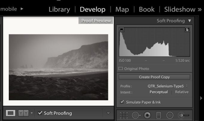
asA soft proof profile is an ICC profile that is used to convert an image’s preview to that of what it would like if it were printed. This conversion takes place within the working space of Photoshop. Lightroom now allows previewing. Earlier when we setup Photoshop to the working spaces we selected (Gray Gamma 2.20 and Adobe RGB 1998). Photoshop uses these working spaces to convert the image on screen so that we can view them in relation to these working spaces. On top of this conversion, it is possible to have Photoshop and Lightroom further convert the image on the display to preview what it would look like printed by selecting a Soft Proof ICC profile.
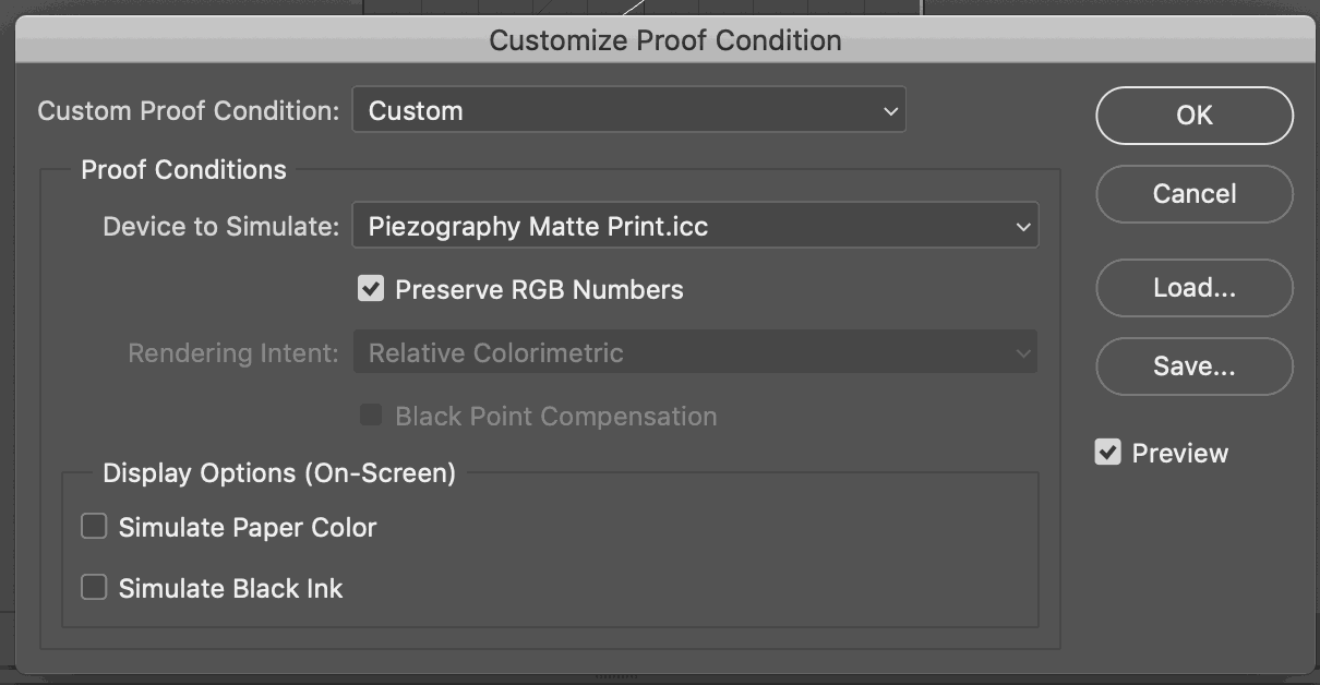
Photoshop and Lightroom do this with Soft Proof function. The user selects an output ICC profile and the image is converted on screen. These output ICC profiles contain information such as the color of the paper. If the image is on a larger canvas, the Soft Proof will show the canvas in the color of the paper. Also, the black point (dMax or black ink) contains the luminosity value and the color of the actual printed dMax. And this is what usually stumps first time Soft Proof users. What happens is that exciting 4.0 dMax of the display is suddenly reduced to the 1.64 dMax of the paper. And yes you miss it when you look at your display - but you can not have it. Well, let’s say you can not print it. What you see with a Soft Proof is what you can print. And it takes some getting used to converting your sexy display into what looks like ink reflecting off paper.
Soft Proof Profiles are available in both Photoshop & Lightroom. Using them is predicated on nothing more than installing them into your operating system. Any output ICC profile can be used to preview an image.
However, the accuracy of the preview is directly related to the quality and accuracy of your display calibration. A Soft Proof ICC profile is no different than an output ICC profile. Output ICC profiles are created for the purpose of converting a file to the output space device so that it prints correctly (or as expected). That expectation is predicated on converting input pixels to output pixels. What you see on your display is not indicative of this process. The calibration of your display, if you wish to close this loop, depends solely on the quality and accuracy of your display calibration.
Piezography Soft Proof profiles however, are not really output ICC profiles. They are produced using the QTR Create ICC tool. They are used in conventional QTR workflow for purposes that can not be used in Piezography workflow. In Piezography, we use them solely as Soft Proof profiles.
The Closed Loop
Soft Proof profiles are the final cog in Grayscale Management:
A dim room.
A properly calibrated display.
A printer in the condition expected by the media profile.
The correct printer driver settings.
An image file tagged with the correct working space that has been edited in the correct working space.
The optional application of the Soft Proof profile during imaging.
And last but not least - the correct workflow during printing.
The critical procedures are related to the printer and the Gamma 2.20 workflow. These govern the output to be linearized and to print your grayscale image input values so that they correlate exactly to the printed grayscale values.
What is optional are the bits and pieces concerning how the image appears to you on the display. This is your expectation. This is your intention. If these are important to you then the calibration procedures, and your display, become critical.
The final optional piece is in Soft Proofing. Do you really need to see the image reduced to printing dynamic range and color to make your final edits? If so - then the entire set of procedures are critical. And the quality and practice is what sets one Grayscale Management system apart from another.