Table of Contents
- Overview
- Dynamic Luminance Detection
- Variable Patch Targets
- Special Averaging Support
- Measurement Smoothing
- Falses Correction
- Start Points
- Channel Curve Smoothing Tutorial
- Variable Ink Limiting
- Target Luminance Calibration
- Contrast Tweaking
- Channel Remapping
- Curve Blending
- Curve Inversion
- Save a Copy
- Physical Ink Mixing and Blending
- Repurposing Clogged Printers
- Ink Placement Charts
- Initial Fill Instructions
- 1400/1430/1500 Instructions
- P400/R1900/R2000 Instructions
- R3000/P600 Instructions
- 3800/3880/P800 Instructions
- 4000 Instructions
- 4800/4880 Instructions
- 4900 Instructions
- 7600/9600 Instructions
- 7800/9800 7880/9880 Instructions
- 7890/9890 Instructions
- 7900/9900 Instructions
- P6000/P8000 Instructions
- P7000/P9000 Instructions
Piezography Manual
By the Numbers
Overview
This is a very old school term that experts were very proud about. They came into Photoshop during the days of CMYK output and were well ahead of the game compared to those who came into printing at the same time they came into Photoshop. What the old schoolers had was experience in using actual CMYK ink values. They new color by its numbers.
They scanned directly to film without any digital image as an in-between. That itself is a difficult concept to imagine. But, it’s true. As the original artwork spun around a gigantic drum scanner the films were being output simultaneously. An array of knobs were turned to alter the output of the film dot being produced with the mandatory requirement that the color (when on press) was correct. That took enormous experience. These old school pre-press people knew what combination of CYMK inks would produce neutral grays and natural flesh tones and bright colors. They were able to isolate any tone and knew its representation in ink values. These ink values were from 0% to 100% in cyan, magenta, yellow and black.
And further, they could convert RGB images into CMYK and devise the type of black plate they required. The expression of black had two forms: under color removal or gray component replacement. The best of the best wrote their own RGB to CMYK conversions. There were not yet Epson inkjet printers that could accept RGB files. Rather, it was all a CMYK world evolving around ink. Printing ink.
So, when we say ‘by the numbers’ - we mean literally by the values of ink. Piezography produces tens of thousands of gray levels of ink. Whether you are imaging in 16 bit grayscale which has 65,536 gray values or 8 bit grayscale which has 256 gray values - you need to only know 256 gray values. You could begin with knowing only 100 values represented by 0% - 100%. That would certainly suit you for working with Epson ABW. But, Piezography is much more sensitive and you really need to familiarize yourself with all 256 gray values. Piezography can actually differentiate between them when used as instructed with a printer/inks both in peak condition.
These 256 values coincide with the RGB values of a grayscale or the Luminosity values of a grayscale where 0 is absolute black (dMax) and 255 is absolute white (dMin). Naturally, 128 would be middle gray.

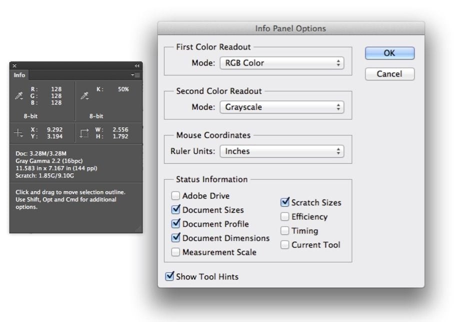
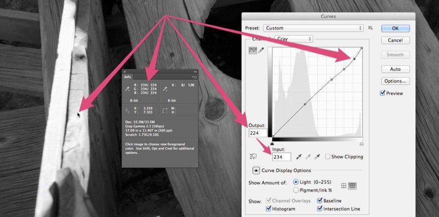
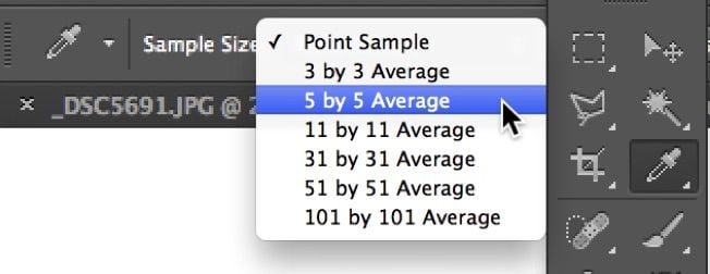 This Info palette has been setup in Photoshop using the above Info Panel Options. By using the Eyedropper tool or any other tool for that matter, wherever the mouse pointer is placed on an image, the Info Palette RGB and K readouts interactively change to reflect the value of the pixels under the tool pointer. The tool is reading a sample of the pixels to arrive at these values and you can adjust the size of the sampling by clicking on the Eyedropper Tool and using the Sample Size menu in the Photoshop options for that tool.
I happen to use the 5x5 most often. But, sometimes I need the point sample (1x1) and other times I need a more generalized reading in the 31 x 31 size.
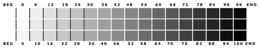
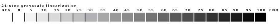
There are some exercises you can do to learn these gray values. You need to come at them slowly and anyone should be able to recognize 21 gray values using the 21 step image files that are so commonly printed these days.
We recommend that you print a 21 step file with the correct Piezography curve and keep this handy. Refer to it while you look at your prints and begin to notice gray values in the prints that you can identify. The 21 step is a gray step wedge in 5% increments. When you installed Quadtone RIP it created a directory: QuadTone RIP / Eye-One / Step-21-gray.tif. You should not have to guess what a flesh tone’s pixel value is. You should know!
The next step would be to begin to learn the 51 step file which is in 5L increments from 0 to 255 or 2% increments from 0% to 100%. Each column reads top to bottom...