
Mark Stracke came up to Vermont to print with me for a two day private one-on-one workshop. Mark has the distinction of coming to Cone Editions for our digital printmaking workshops more than any other customer. He started back in 2002 when I first introduced PiezographyBW Pro on the Epson 7000 printer. He came to take a workshop that George DeWolfe taught here several years ago. He has taken workshops here with Larry Danque and with Geoff Spence. This was his fifth trip to Vermont.
Mark is the Visual Arts Department Chair and teaches photography at the Ethical Culture Fieldston School in Bronx, NY. I have always thought that Mark has an amazing photographer’s eye. I have been a fan of his work for some time. He has a tremendous amount of visual patience and can concentrate on one subject for a long period of time. I love his work.
Mark has his own studio which includes a Howtek drum scanner, large and small format Piezography printers. So his quality expectations are very high and his own printing experience is strong. He often shoots large format with Polaroid 4×5 direct negative film, a film which is now extinct. Mark says he still has a small stash of this film left. Mark is no stranger to digital. He uses a Canon 5D-MKII and often makes HDR exposures. Many of the prints we made were of B&W HDR images. It changed my mind about how I think about HDR. I’m not a fan of color HDR because it seems so unrealistic to me. But, the B&W version of this process can be very compelling. I plan on exploring it soon.
At one point, we were concentrating on one image of his that I wished I had shot. From time to time I see photos that make me wish I had shot them. Photo envy…I’m way too incidental sometimes in my own shooting. Mark had known this particular subject place for a long time, and very carefully chose the day and the hour of day when he knew the shadows would be right. In fact, Mark showed me a photo that he took that had only a few hours opportunity on one particular day of the year when the sun is at the right angle to make it between buildings and do its thing. I wish I had Mark’s photographic patience. I admire it. It’s something else for me to aspire to now.
So, this photograph of the Regent Control building that we were concentrating on has that perfect combination of contrasts. We were printing it in both Piezography Warm Neutral Glossy and Piezography Selenium Glossy on both JonCone Studio Type 5 paper (which is unlike anything else in this country right now), and Epson Exhibition Fiber paper. Type 5 is a non-OBA baryta paper which is now regarded as the best baryta paper being sold.
Incidentally, when I heard that Epson was discontinuing Exhibition Fiber, I literally bought a ton of it. I like it very much. I used to sell a particularly similar sheet to it. But, the same manufacturer of it could not offer me the same premium quality as they did Epson. My Type 4 paper was made by the same mill in both surface and coating. Anyway, I bought a ton of paper in 24 x 30 and 13 x 19, and now I hear it’s not discontinued. So I have a ton occupying a large space in the studio. On the other hand, I paid 1/3 of what it now costs…
So we printed this image in these two inks on these two papers. You can click them for a larger gallery of images is you wish.

Piezography Selenium on JonCone Studio Type 5

Piezography Warm Neutral on JonCone Studio Type 5
Mark was favoring Selenium on the colder paper, but wishing for the warmer shadows of the Warm Neutral inks . So we decided that the perfect combination might be somewhere in between, and I made my first split toned glossy prints with Mark.
I asked Dana Ceccarelli to make a 50%-50% mixture of Selenium shade 4 and Warm Neutral shade 4, and then make up a set of inks with shades 2 and 3 of Warm Neutral and shades 5, 6, and 7 of Selenium. The black shade is always common between our ink sets. In this case making glossy prints, we used Piezography MPS Black which is our version of a photo black. She filled up a set of Epson 2880 refillable carts and made a Piezography curve for me on both the Exhibition Fiber and the JonCone Studio Type 5 papers. While we were printing large format downstairs, Dana printed the same image for us on 13×19 papers on the Epson 2880 printer in our R&D lab.

Piezography SplitTone Glossy on Exhibition Fiber

Piezography SplitTone Glossy on JonCone Studio Type 5
The two papers treated the split tone differently. Probably the most satisfying for Mark was on Epson Exhibition Fiber. This had the most gelatine glow I have ever seen from my inks. This perfect combination of ink and paper – produced a light reflection that was so deep. I thought we were looking at darkroom paper to be sure. But, on the JonCone Studio Type 5, the split produced a beautiful contrast in the the 1/4 tones. The building’s concrete facade was filled with a local contrast unlike anything I have seen to date. It was so amazing. I favor warmer papers these days – not just because of a recent OBA failure that shocked me – but because when it’s all said and done and there are no side-by-side comparisons with brighter papers – the non-OBA papers really do stand on their own.
I learned a lot from Mark. He came up to learn from me…but his patience in photography convinced me to order a 85mm Canon prime to replace a zoom I had on loan from Tamaron. I already own the Zeiss Distagon 21mm for my Canon 5D-MKII. I am actually tempted to give up on zooms altogether and go back to moving my body back and forth again. This way I get to shoot through superior glass and get more exercise! My new Canon prime arrives today. One-on-one workshops are sometimes very beneficial to me.
If you’re wondering if Mark got what he needed. I think so. First of all, he needed to come up with a way to produce neutral black & whites in his Blurb books and I believe I came up with something that should work to counteract the Blurb ICC. He plans to test it on an eight page book. There were a number of other important questions I answered. Then it simply turned into a pleasurable print-fest. Mark may have come up with a split tone glossy Piezography system that he will install. But, like many, his studio is small and another printing system will take planning. I believe he is choosing between a 3880 which can print matte and glossy Piezography without switching inks, or a 7880 which he could install a matte and glossy Piezography system and use a spare 7000 to apply the Gloss Optimizer. That’s what we do in our studio. We keep the 7880s for matte and photo black options and use a 7600 dedicated to seven channels of Gloss Optimizer which allows us to quickly overcoat our glossy prints. Otherwise, one needs the nine channels of the Epson 3880 or 3800 system to do both matte and glossy printing without switching the blacks.
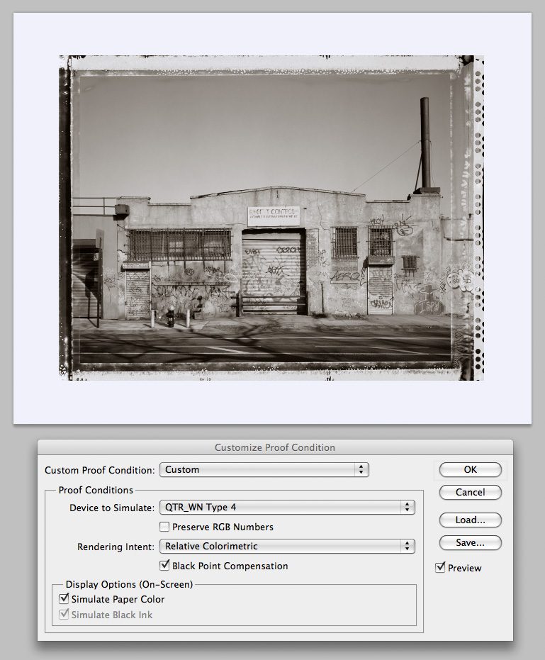
If you would like to see SoftProof ICCs of the ink combinations discussed here, you can download them by clicking here. Install them where you normally install printer ICC profiles and then simply use the Soft Proof function in Photoshop as illustrated below. Note that when I Soft Proof, I draw a larger white canvas around the image so I can also see the paper color produced by the SoftProof ICC. If you still do not understand what Soft Proofing is. It is the ability to preview on a calibrated display how an image will print on a particular ink/paper combination. The higher quality the display and calibration, the more accurate the Soft Proof. I use Eizo displays which are hardware calibrated!